


Final full colour vector based drawing of the university crest replicating the hand painted original as closely as possible.
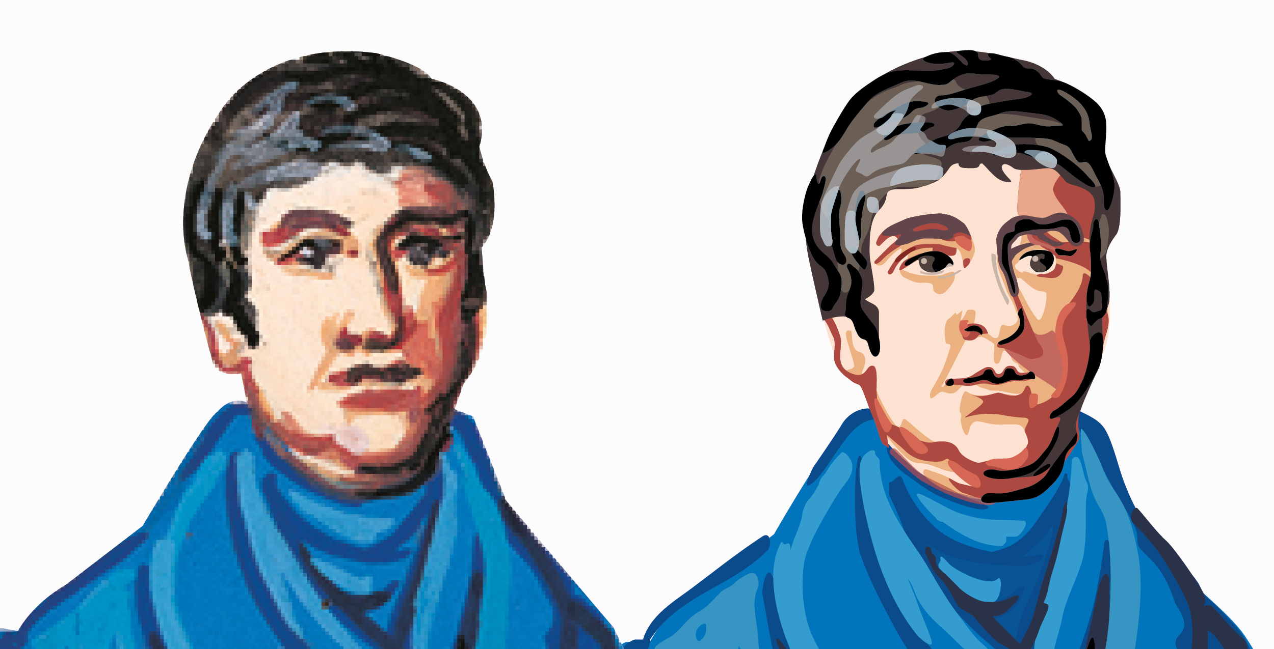
The only file held for the University Crest was in raster format as the original was hand painted. I was commissioned to redraw the crest in vector format which would allow its size to be increased without any loss of image quality but would also allow for the creation of spot UV’s for example, using the newly created paths. The original is shown (left) and the final vector version is shown (right).
As progress was made I realised that while the suggestion of facial features works extremely well in wet media at a set size this approach didn’t translate to the scaleable vector format. The challenge was to retain the overall feel of the original in Thomas Telford’s face while adding additional detail to make it convincing at large scale.
Detail showing Thomas Telford’s eyes showing how the quality and focus is retained even at very large sizes.
In order to faithfully replicate the brush marks and additive nature of wet media found in the original I created a custom brush which allowed me to draw more naturally and also used opacity.
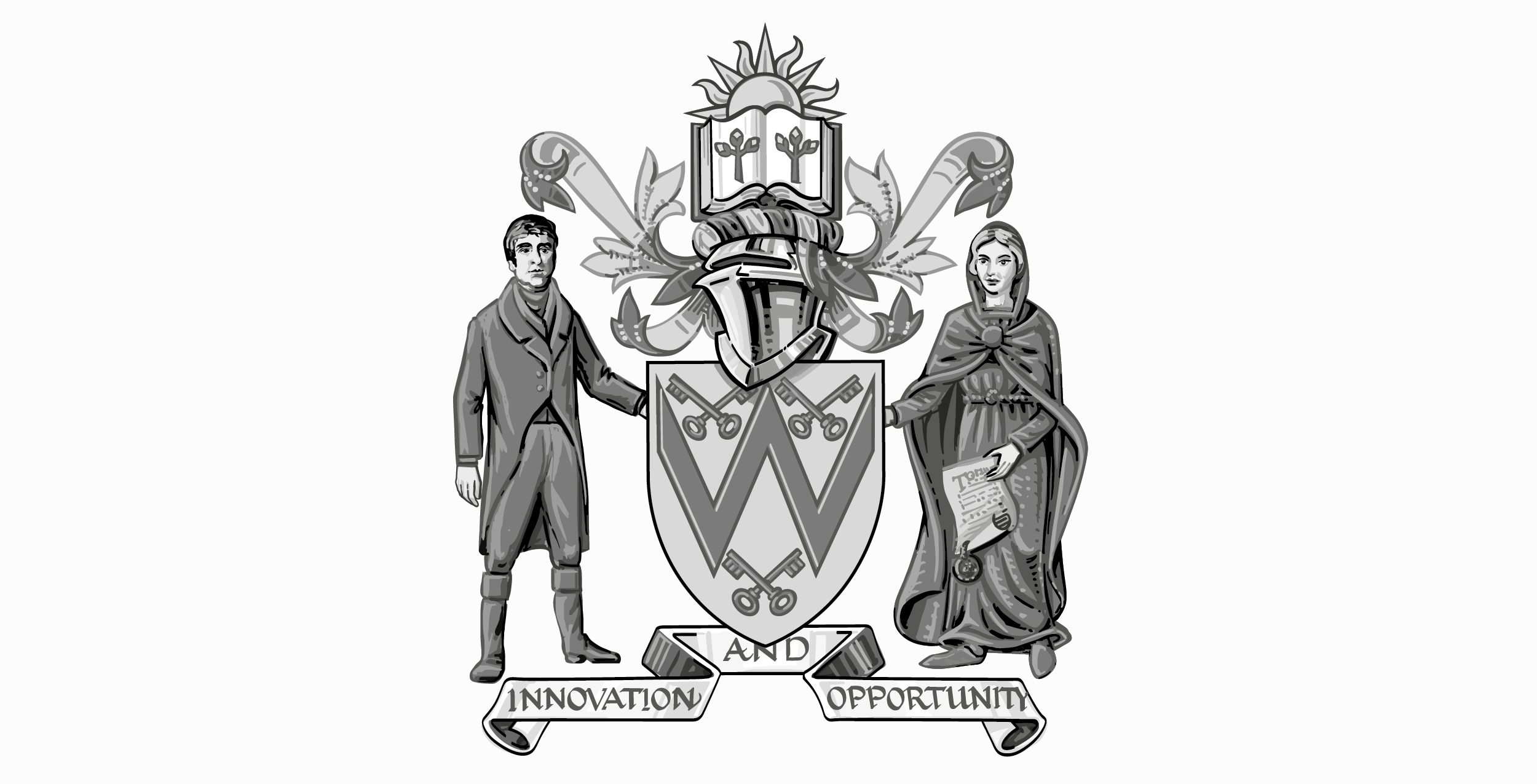
A greyscale version was required which retained the same tonal balance as the colour version. This was checked on screen and also via a hard proof.
All versions were pixel snapped to ensure they retained maximum clarity on screen.
An outline version was also produced which could be printed in one colour without the use of gradients or tints. The was created to match the colour and greyscale versions exactly so that it could, if required, be used to create a blind emboss or deboss for example.